Home Cookin’ Hunter’s Branding Project
If you haven’t heard of Home Cookin’ Hunter – where have you been?? Joel Lickliter is the personality behind the new movement and Stacy, his wife, is the camera. The two of them make a great team – and even better – they make great videos on YouTube for all to enjoy. (Check out their videos!)
When Joel and Stacy approached me about Home Cookin’ Hunter’s branding and image – I was delighted! I’m an avid supporter of anything organic and knowing where your food comes from – so to be a part of this movement in a marketing capacity was totally intriguing.
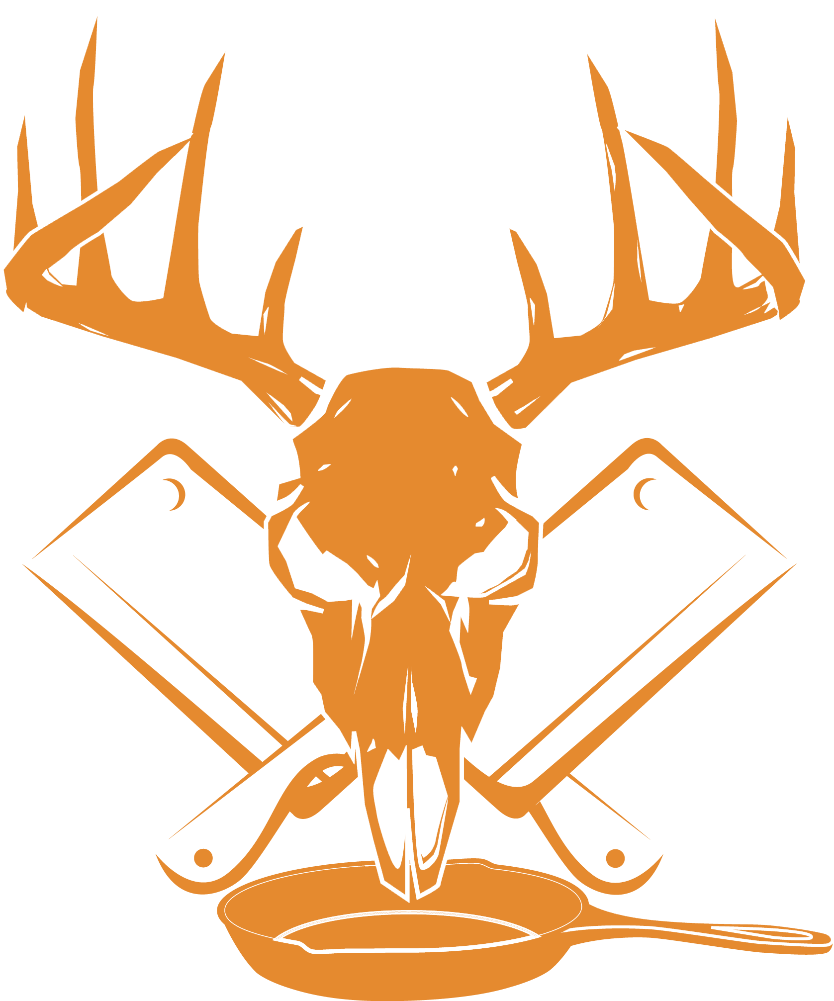
Joel and Stacy already had a picture in their mind. But all our communication was on Facebook Messaging. They sent me the following hand-drawn image to work from and definitely wanted something “manly” – Joel’s words, not mine.

After scratching a couple versions together and going through a few edits, we established his color palette pretty fast. If you haven’t used Colour Lovers before – it comes in quite handy when clients have an idea of a color in there head and want to build complimenting colors around it. A quick search there led us directly to the perfect “Hunter’s Orange” that Joel was picturing and we were able to find a complimentary gray.
After a few renditions of “Try it this way” and “How about if we did it like this” – our Facebook conversations came to an end. We finally had it!
As you can see we made some modifications to his original plan. Rather than a fork and knife crossing behind the skull, we decided on two crossing cleavers. The rustic design of the brand fits perfectly with Joel’s vision for his brand.
Follow Home Cookin’ Hunter’s on Facebook and YouTube. I must admit – his videos are addicting!


